UI Design
Cinema Closet
From cinema scenes to your closet.


My role:
Product Designer
Competitor Analysis, User Research, Persona, Job Stories, Design System, User Flow, UI Design, Prototyping, Usability Testing, Accessibility Designing.
Duration:
March – April 2024
5 weeks.
Team:
Individual Work
Platform:
Mobile App, IOS
Tools:
Figma, FigJam.

OVERVIEW
Cinema Closet
This project aimed at building an app where viewers of films or TV shows can find the characters’ clothes and accessories from specific scenes quickly and accurately.
THE PROBLEM
There’s almost no product for film lovers who want to imitate their favorite characters.

The current market lacks a digital product that enables users to either quickly spot the styles they saw on the screen or find similar alternatives if they do not want to afford the exact item.
(Styles From Screens)
NEEDS
01
Difficult to find similar alternatives
Current products do not consider whether the audiences can afford the item or whether they want to purchase the exact same item.
02
Cannot find styles for specific eras
Users find it difficult to spot styles of different eras, such as the 1980s, impeding experiences for cosplayers who want to replicate different eras’ styles.
03
Hard to spot items through searching for keywords
Users have difficulties recalling the keywords, such as the character’s name or the style’s name, increasing cognitive load and effort for them to find the items.

"How can we make Cinema Closet not only a tool for users to quickly and precisely spot their favorite screen styles without having to search for the keywords that they don't know, but also enable them to find alternatives and styles of different eras."
THE SOLUTION
Cinema Closet streamlined the screen styles spotting process for diverse users, allowing them to seamlessly imitate the styles they like without encountering barriers.
01
Provide Both Exact and Similar Items
Provide viewers with multiple choices for each item, and viewers can select one to purchase based on their preferences, such as buying the exact same item or a cheaper similar item.
02
Categorize Movies by Background Eras
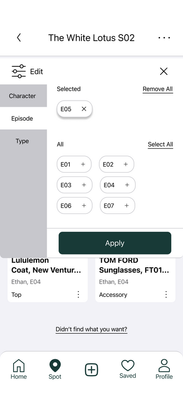
Use the movie’s background era instead of its release year to label it, fulfilling the needs of viewers who wish to replicate the look in a different era.
03
Linear Navigation for Style Spotting
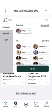
Use a linear search box similar to travel apps to enable users to quickly and precisely spot the items they recently saw on the screen through recognition rather than recall the keywords they don’t remember or know.
Primary Audiences: Film/TV show lovers who enjoy imitating screen styles and want to browse different kinds of styles when they are free.
Secondary Audiences: People who recently watched a film/TV show and want to quickly and precisely spot the styles that the characters wore.
Project details starting from here! ⬇️
DESIGN PROCESS

1️⃣
User Research
To better know what are the pain points and unmet needs that cinema-style lovers have, talking with them is always the most direct and easy way.
Holding 2 research questions:
👚
How do people find an outfit they saw in a film?
🛒
How do people usually buy things using apps?
I conducted semi-structured interviews with 5 film/TV show lovers who like the outfits on screens.
Some Key Findings 🔎 :
01
High expenses of items make users unwilling to afford them.
02
Hard to memorize the keywords for search, leading to a high cognitive load.
03
Prefer to save the item first and purchase them later.
04
Difficult to find styles of different eras.
05
Some items are not accurate, leading to frustration while searching.
2️⃣
Competitor Analysis
Since Cinema Closet enables users to spot styles and find purchase information, it is kind of like an app that combines film apps and shopping apps.
Therefore, the three competitors I analyzed are:

Spotern
Film Styles App


✅ Good
01
Contains screen style organizing and categorizing features.
02
Organizes styles by films.
03
Organizes styles by characters.
04
Organizes styles by categories.
❌ Bad
01
Hard for users to research through the keywords.
02
Cannot categorize styles based on eras.
03
Wordy texts are overwhelming.
04
Lacks alternate/similar styles.
05
Lacks usability.

IMDb
Film App


✅ Good
01
Well-organized carousels for users to browse.
02
Personalized content based on users’ previous searches.
03
Contains thorough film/TV show information, including eras, categories, episodes, characters, etc.
❌ Bad
01
The home page is unclean.
02
Does not contain screen style information.
03
Lacks usability.

Amazon
Shopping App


✅ Good
01
High usability.
02
Recommends alternate/similar items within each item’s page.
❌ Bad
01
Does not show information about whether the item appears in a film/TV show.
02
Categories are not mutually exclusive.
3️⃣
Persona
Based on the research conducted, I have developed a concrete persona called Tamara. Tamara represents the target users, reflecting key insights and characteristics identified through the studies.

(User Persona)
4️⃣
Job Stories
I created 5 job stories to reflect Tamara’s needs.

When I see an outfit in a film/TV show that catches my eye,
I want to be able to immediately spot the outfit without searching for the keywords that I don’t remember or know,
So that I can easily find the item without having to spend efforts to recall the keywords.
When I find a piece of item that I like but it’s too expensive for me,
I want to be able to easily find similar alternatives,
so that I can recreate the look within my budget.


When I am interested in the fashion of a specific era shown in a film/TV show,
I want to filter items by the era of the background settings,
so that I can explore and purchase the styles that reflect those eras without having to search them by myself from other place.
When I discover an item that I want to purchase later,
I want to be able to save it now and find them later,
so that I can buy it at a more convenient time without forgetting it.


When I see the item I want to buy is not same as the item appeared in the film/TV show,
I want to quickly report it as inaccurate and get noticed once it has been updated,
so that I can ensure the style I want to imitate is accurate.
5️⃣
Mid-Fidelity Prototypes
With Tamara’s needs and human-centered design strategies in mind, here I came to the design phase.
I started the design with the mid-fidelity prototype.
(Mid-Fi Prototypes)
6️⃣
Design System
To ensure the design’s consistency, aesthetics, and reusability, I created a thorough design system.
01
Brand Colors
#183A37
Green 50
#C44900
Red 30
#EFD6AC
Egg
The brand colors of Cinema Closet give users a sense of classic elegance, which matches the value of classic cinema fashion that Cinema Closet conveys.
02
Logo

The colors of Cinema Closet’s logo reflect the brand of the platform. The font style of Cinema Closet’s logo is Norican, which gives a sense of classic to audiences, reflecting the brand value of re-creating classic cinema fashions.
03
Font
The font style of Cinema Closet’s app is SF Pro. This font style is consistent with IOS’s style, increasing the overall aesthetic caused by consistency.
04
Spacing

All spacings in Cinema Closet are multiples of 8. This approach ensures the overall consistency of the product. On the other side, this spacing standard is also consistent with the IOS system. Additionally, sufficient negative space can reduce users’ cognitive load, and also make it easy to group different items.
05
Design Tokens

(Design Tokens - Primitives)

(Design Tokens - Color Tokens)

(Design Tokens - Dimensions)
The reason to create design tokens is that design tokens provide a centralized way to manage and update design properties across an entire system. They can make my design more consistent, manageable, and reusable.
7️⃣
Components
Then I created the components, which can help to create and manage consistent designs across the project.

(Element Components)
(Icon Components)
8️⃣
High-Fidelity Prototypes
Like building Lego, using the elements I created in the last step, I designed the initial version of the high-fidelity interactive prototypes.

(Interactive Prototypes)
9️⃣
Usability Testing
To test its usability, I recruited 5 potential users and conducted usability testing sessions adopting the think-aloud protocol, post-test interview, and System Usability Scale (SUS).
Results
82
👍
SUS Score
Excellent
100%
✅
Task Completion Rate.
(Usability Testing Quantitative Data Analysis)
01
The pin icon has low visibility

➡️

Solution: Changed the color of the spot label to make it more visible.
02
The pictures are small and hard to see

➡️

Solution: Changed the shape of the cards, making them into larger cards to enhance the pictures’ visibility. The layout has been changed as well to make the space more efficient and present the same amount of the cards within same space as the old version.
03
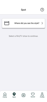
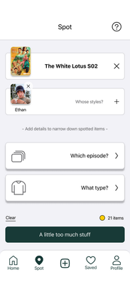
The spot page does not have enough clear instructions, users are unsure whether they need to add details


⬇️


Solution: Adopted the Feedback Loop Theory. Added color dots to give users immediate feedback on whether to add details. Changed the text on the button to give more instructions.
04
The item purchasing cards are not very visible since they are under the relevant search section and users have to scroll down to see them

➡️

Solution: Changed the place of Relevant Search and Matched Item. Made Matched Items at the top and let users see them without scrolling down.
🔟
Accessibility Check
To make sure the design is accessible and readable, I checked all the color combinations in my design following the WCAG 2.0 standard.
(Color Contrast Accessibility Check)

Let's look at my final deliverables! ⬇️
🎬
Final Deliverables

The user flow is divided into 4 steps:
1. Login to the account.
2. Spot the item.
3. Edit the spot.
4. Find and save the item.
01
Login to the account
(Login/Sign Up Pages)
02
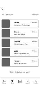
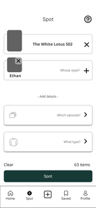
Spot the item
(Spot Items Pages)
03
Edit the spot
(Edit Spots Pages)
04
Find and save the item
(Find and Save Items Pages)
📚
Key Takeaways
01
Never underestimate usability testing
👨💻
As designers, we cannot be complacent with our designs. Instead, testing whether users enjoy our product is essential. During my usability testing, I was surprised to find many obvious usability issues in designs I was initially satisfied with. Therefore, testing with users is always the most crucial step in creating a product that satisfies them.
02
Considering human cognition in design is the key to UX
🙆♂️
As a human-centered designer, my background in communication technology provides a solid theoretical foundation for making my designs more user-friendly and reducing cognitive load. In my work, I apply Miller’s Law and Feedback Loop Theory to create a seamless and intuitive user experience. This has made me realize that understanding human behavior, preferences, and capabilities is always the key to UX.
Thanks for reading!
Designed by: Zhenbo Wu


